top of page
Hey👋
I'm Maddy
I'm a Digital | UX/UI designer based in Sydney, with over 6 years of experience in design. Solving problems has always been my passion and that's exactly why I love designing for the users.
Expertise:
Wireframing, User Research, A/B testing, Digital Design, Usability testing, Visual Design, Landing Page, Figma, Sketch, XD
My Portfolio
UX and UI design projects over the past few years. With a strong focus on designing intuitive interfaces and solving UX issues for E-commerce platforms.


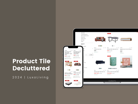
Product Tile Decluttered
Decluttering for Clarity: Enhancing Product Tile Design to Drive Conversions
What I did in this project:
1. Research
I began by evaluating the existing product tile layout across collection pages, identifying alignment issues and excessive visual clutter that hindered readability and user focus. I also reviewed competitor sites within the eCommerce and home décor space to gather best practices for displaying product information and CTAs effectively.
2. Internal Collaboration
To ensure alignment across teams, I collaborated with stakeholders from marketing, product, and content to clarify what information and actions were most critical to highlight on each product tile.
3. Design Execution
I redesigned the product tile layout by creating two different variations, to improve visual hierarchy, streamline content, and enhance the visibility and accessibility of CTAs. The refined design was shared for feedback, iterated based on input, and finalised in Figma with improved alignment, contrast, and spacing to support better user engagement and increase conversion rates.
4. A/B Testing
To validate the design improvements, we conducted A/B testing over a two-week period, comparing two updated variations against the original layout. The results showed a clear performance winner, which we then implemented on the live site.


Delivery Date Display
Improved the functionality of the shipping calculator and clarified the presentation of the expected delivery date. The previous design contained excessive text, making it difficult for customers to quickly understand key information.
What I did in this project:
1. Research
I reviewed the existing delivery date display and identified key usability issues, including dense text layout, poor readability, and unclear presentation of critical information. I also explored best practices from other eCommerce platforms to better understand how to communicate delivery expectations effectively.
2. Content Simplification
To reduce cognitive load, I reorganized the content to highlight only the most relevant details. I introduced a cleaner hierarchy and worked with stakeholders to trim down unnecessary text, focusing on what users care about most—when and how their order will arrive.
3. Visual Enhancement
I incorporated visual elements such as icons to support key information and improved spacing, font sizing, and color contrast for better readability. The redesigned layout ensures the delivery date is easy to locate and understand at a glance.
4. Validation
After finalising the design in Figma, I shared it with key stakeholders for feedback and made refinements based on their input. The new design offers a more intuitive and user-friendly experience, reducing confusion and improving overall trust in the checkout process.


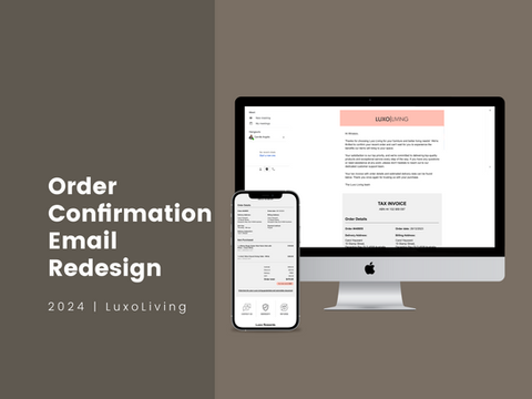
Order Confirmation Email Redesign
The existing order confirmation is produced using a Klayvio template. It requires a redesign to enhance its aesthetic appeal and align more closely with the brand identity, while also ensuring the clear presentation of essential information.
What I did in this project:
1. Research: I conducted industry research focused on home décor, identifying visual benchmarks and reference materials to inform the new design. Additionally, we distributed a questionnaire to gather user feedback and pinpoint pain points in the existing email template.
2. Internal Brainstorming: To streamline the process, I collaborated with colleagues from other departments to collect and verify all necessary content for the new email. This cross-team preparation significantly reduced back-and-forth communication during the design phase.
3. Design Execution: I began with low-fidelity wireframes to gather early feedback from the team, then refined and finalized the design in Figma based on the input received.


Filter Redesign
The primary objective of this project is to enhance the user experience by redesigning the filtering system. Filters play a crucial role in helping users narrow down their search and find relevant content efficiently. By improving the usability and effectiveness of filters, we aim to increase user satisfaction and engagement with our website.


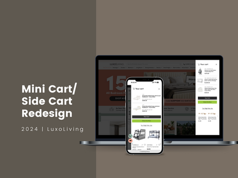
Mini Cart Redesign
The desktop mini cart in the side navigation requires a redesign due to spacing issues and insufficient colour contrast. A new mobile version is also needed to ensure a consistent experience across devices.
What I did in this project:
1. Research
I began by auditing the existing mini cart experience, identifying usability issues such as unclear item hierarchy, poor CTA colour contrast and visibility. I reviewed user sessions on Clarity to get a better understanding of the pain point. I also reviewed industry benchmarks and best practices to see how leading eCommerce platforms structure their mini cart interactions.
2. Design Execution
I developed several low-fidelity wireframes to explore layout improvements and information hierarchy. After gathering internal feedback, I refined the final design in Figma, focusing on a cleaner structure, clearer CTAs, and improved visibility of key details like item quantity, pricing, and total value.
3. Usability Testing
We conducted quick usability tests with internal users and stakeholders to validate the flow and clarity of the redesigned mini cart. Feedback was incorporated into the final version before handing over to development.


Landing Page Design - Digital Campaigns
Over the past years, I've dedicated my efforts to crafting landing page designs that prioritise seamless integration with brand identity and website cohesion. These designs are tailored to ensure a harmonious user interface experience across the entire platform.


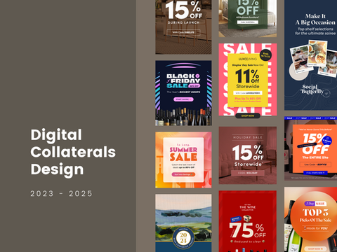
Digital Collaterals Design
This includes web banners, affiliate advertisements, and eDMs. These design elements are essential for businesses looking to showcase their work and reach a wider audience online.
bottom of page